How To Plot Stress Vs Strain In Excel

Okay, let's be honest. Spreadsheets aren’t exactly known for their wild parties. But they are the backbone to visualizing data.
Taming the Beast: Stress vs. Strain in Excel
First things first, open Excel. I know, I know. It's not exactly like cracking open a cold one on a Friday night.
Step 1: Wrangling the Data
Got your stress and strain data? Fantastic! Dump those numbers into two separate columns. Column A can be *stress*, Column B can be *strain*.
Make sure they line up! You don't want your high stress value associated with a low strain value. That is, unless you are trying to make some fictional data!
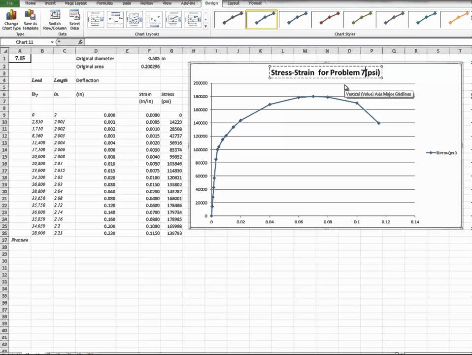
Step 2: Charting a Course (Literally)
Select your data. Click and drag, baby! Highlight all those lovely little numbers in Columns A and B.
Now, go to the "Insert" tab. Then find the "Scatter (X, Y)" chart. Pick the one with just the dots. None of those fancy lines just yet.
Step 3: The Graph Appears! (Hopefully)
Ta-da! A graph! If it looks like a plate of spaghetti, don't panic. We can fix it!
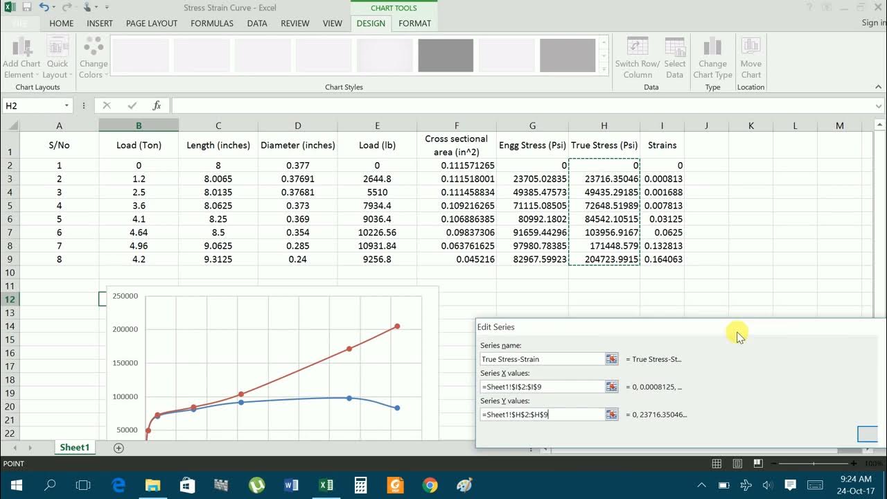
Right-click on the chart. Select "Select Data." A window pops up.
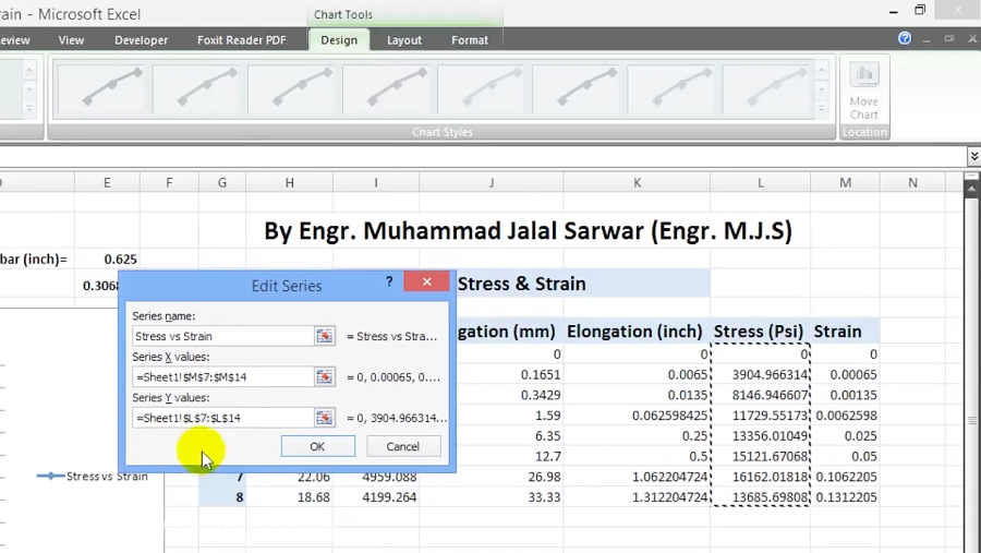
Step 4: X Marks the Spot (and Y Too!)
Under "Legend Entries (Series)," you might see some weird default data. Ignore it. We’re smarter than that.
Click "Edit" under "Horizontal (Category) Axis Labels." Now comes the *important* part. In the "Axis label range", tell Excel where your *strain* values are. Those are your X values, remember?
Repeat that process for the "Series X values." Select where the *strain* values are again. Then the "Series Y values". Finally, show excel where the *stress* values are.
Step 5: Axis Makeover
Click on the axes. Seriously, just click on them. Then, right click, and "Format Axis".
Now you can change the minimum and maximum values. Set them to reflect your data range. Get rid of those awkward empty spaces!
You can also mess with the major and minor units. It's all about making your graph look pretty (and readable, of course).
Step 6: Labelling the Battlefield
Click on the chart. Go to "Chart Design" tab (it pops up when the chart is selected). "Add Chart Element".
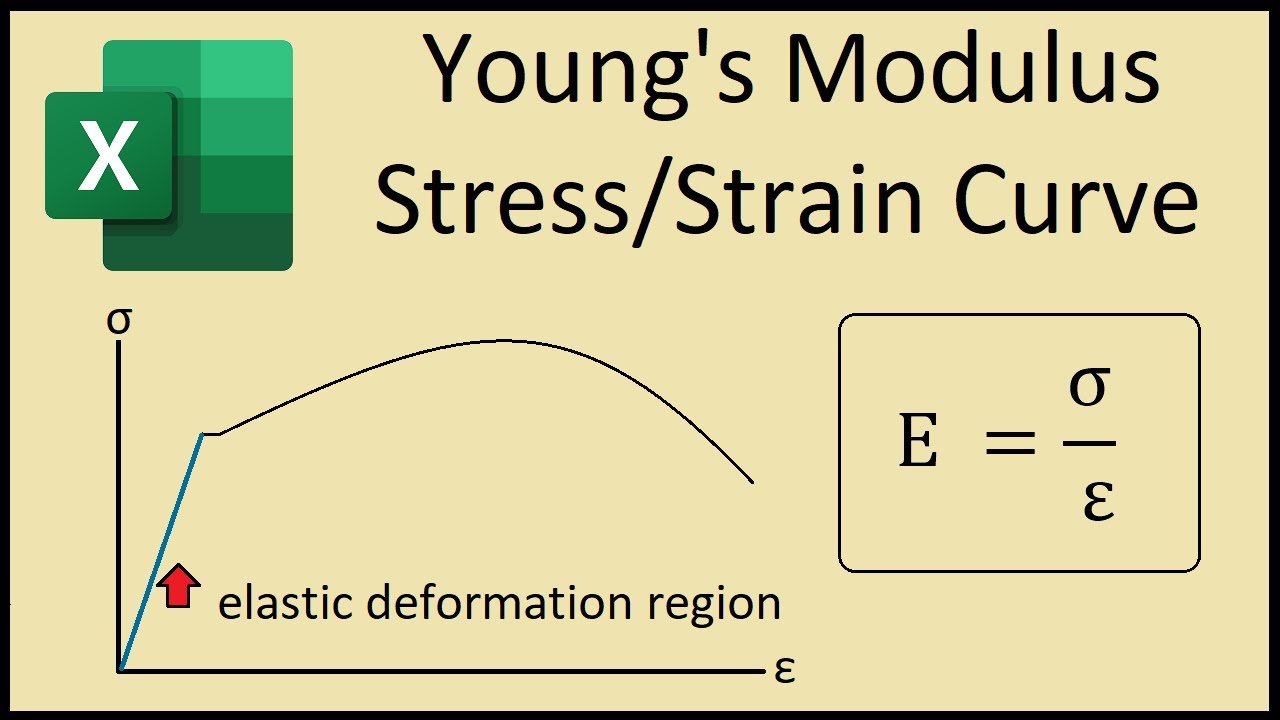
Add axis titles! *Stress* (with units!) goes on the Y-axis. *Strain* (unitless, usually) goes on the X-axis.
A chart title is a good idea, too. Be descriptive, but concise. For example, “Stress vs. Strain Curve for Material X”.
Step 7: Line Up! (Maybe)
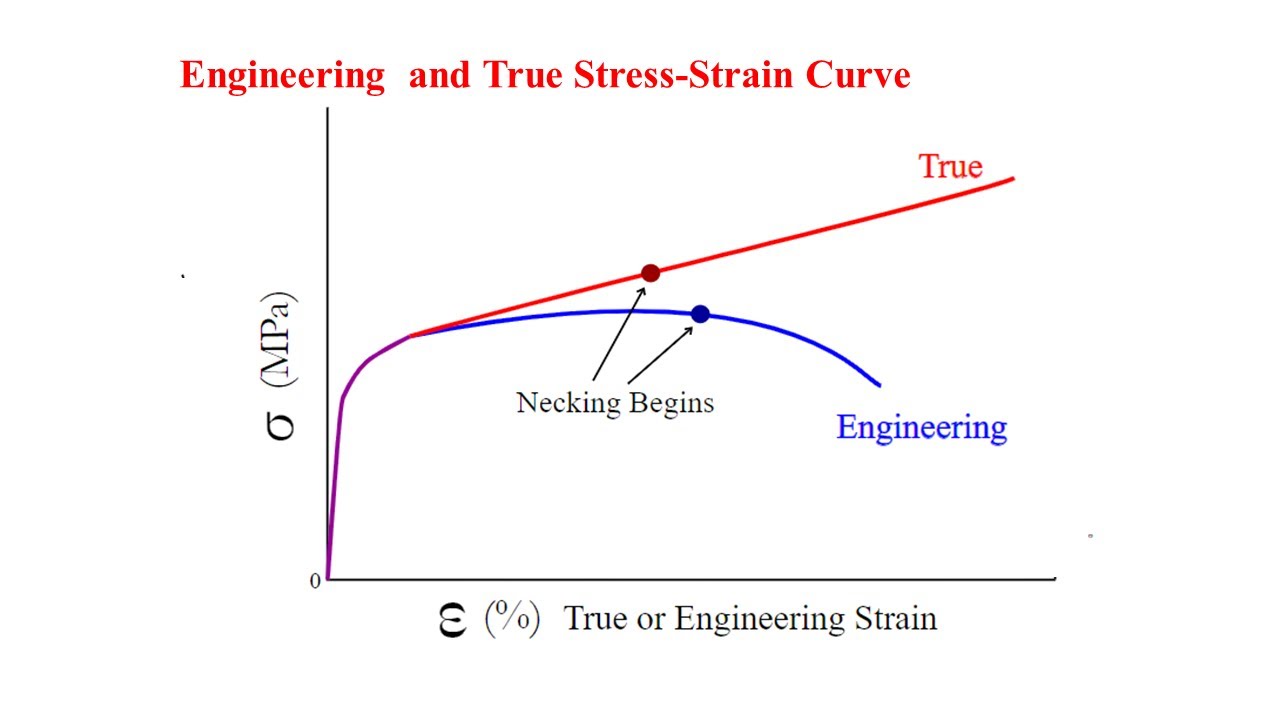
Want to add a line? Click on the data points. Right-click. "Add Trendline."
Excel will try to guess the best fit. Linear? Polynomial? Exponential? Experiment!
Unpopular opinion: Sometimes no trendline is better than a bad trendline. Don't force it if the data doesn't want to be forced!
Step 8: Admire Your Handiwork (and Save!)
There you have it! A stress vs. strain plot in Excel. Not so scary, right?
Now, save your masterpiece. Preferably in a format that won't become obsolete in five years.
And remember: Data visualization is an art. There is no one single right way! Experiment, learn, and don’t be afraid to make mistakes.