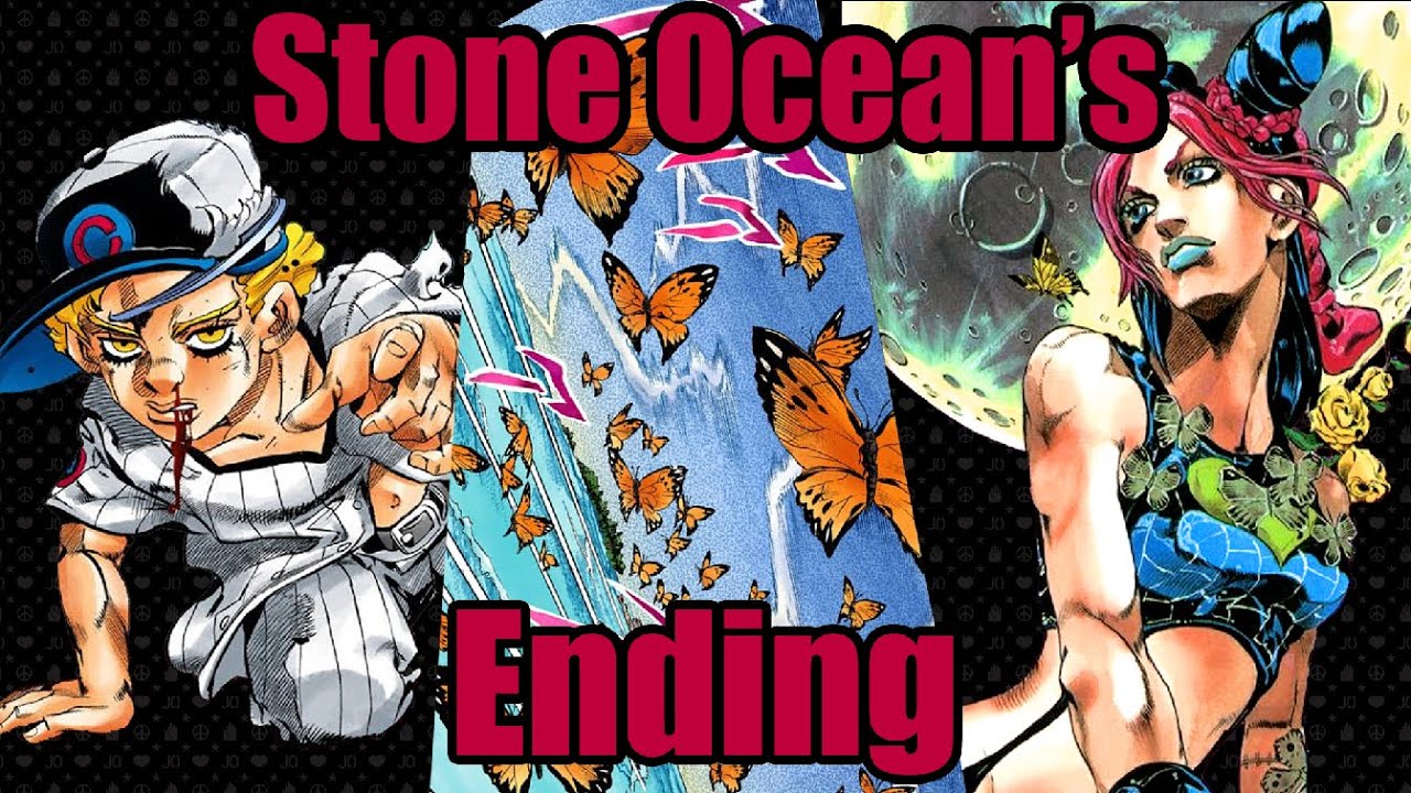
Why Does Stone Ocean Look So Bad
Okay, let's talk Stone Ocean. Specifically, let's chat about why some folks think it doesn't quite reach the visual heights of previous JoJo's Bizarre Adventure anime seasons. Is it *bad*? Maybe not bad-bad, but… different. Let's dive in!
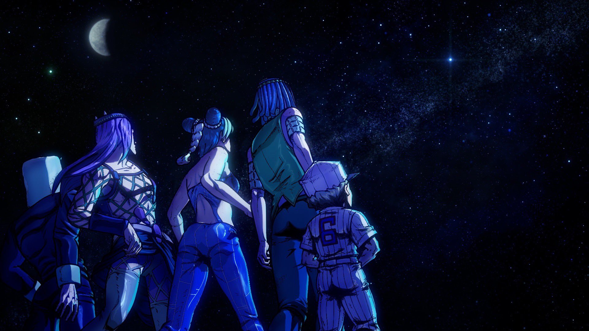
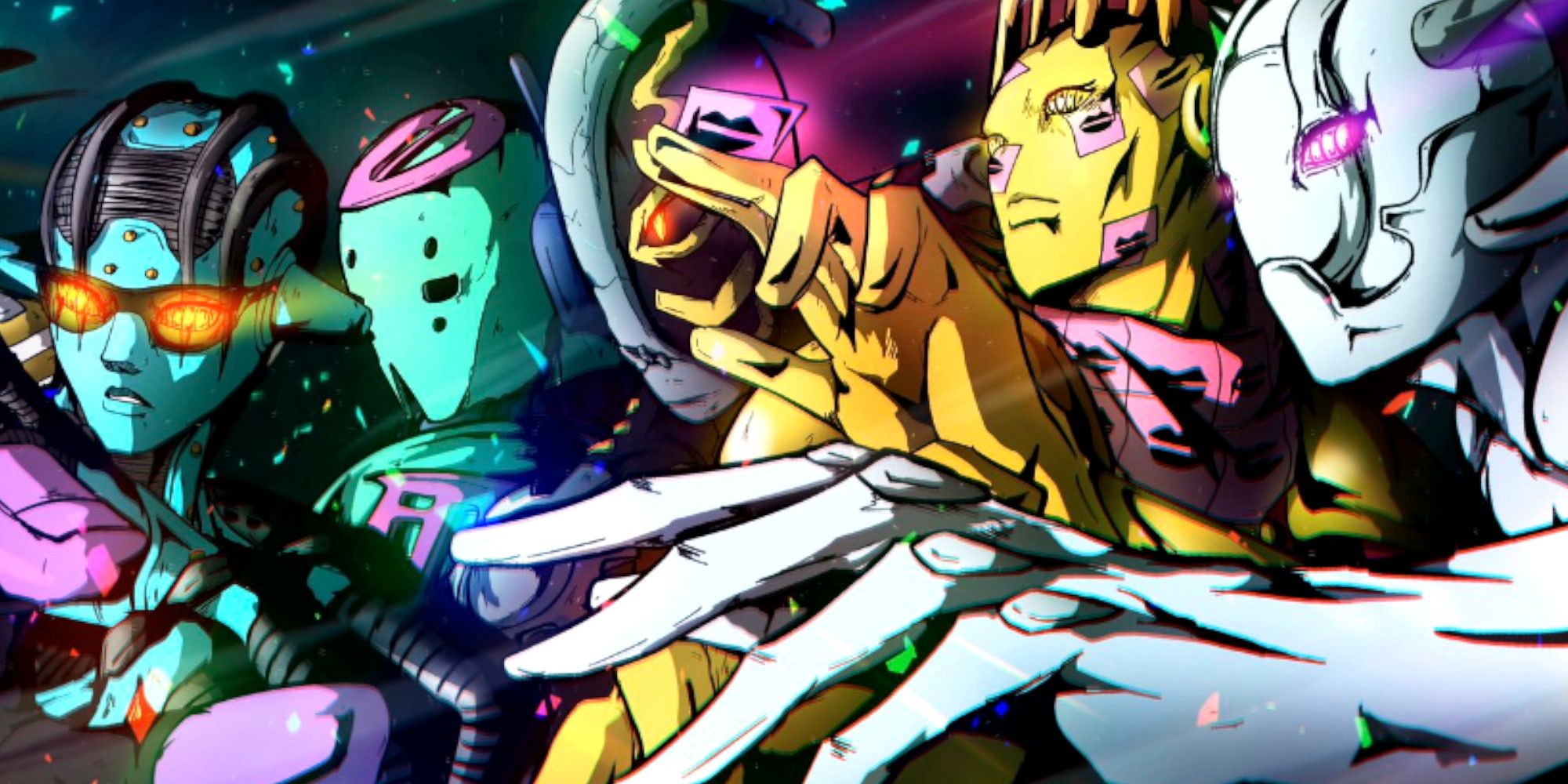
The Colors... Oh, The Colors!
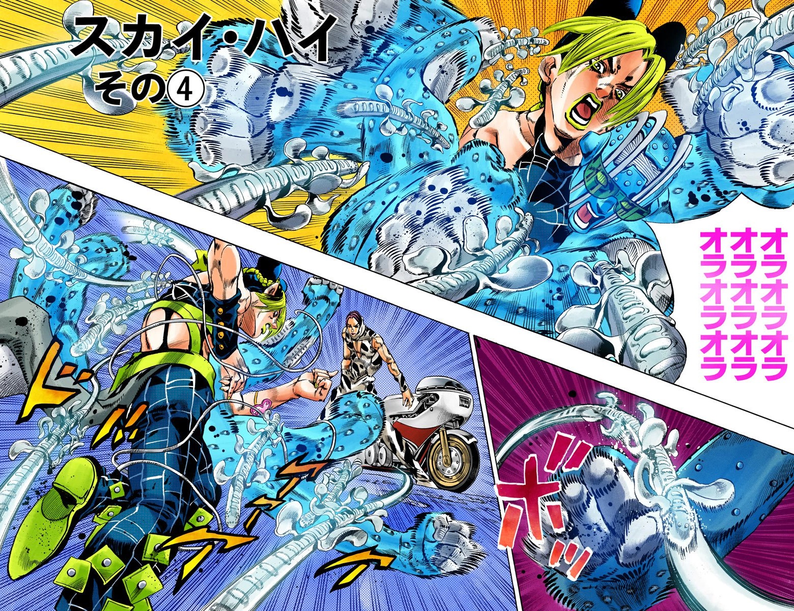
Imagine you're decorating your living room. You decide to go bold and pick, say, neon green and hot pink. All over. Every wall. That’s kind of what the color palette sometimes feels like in Stone Ocean.
Previous seasons had a certain visual flair, but Stone Ocean can feel like someone cranked the saturation slider up to eleven. It's a stylistic choice, sure, but it can be a bit much for the eyeballs.
Think of it like this: a delicious cake is amazing, but a cake made entirely of pure sugar? It will give you a stomachache. This is what the *Stone Ocean*'s color is like.
Animation Woes: Jolyne's Adventures in Static Posing
JoJo is known for its dynamic poses and fluid animation. But sometimes, in Stone Ocean, the characters look like they're striking a pose for a magazine cover... and then staying that way for way too long.
Picture this: you are trying to draw an anime character. But when you are about to start drawing the movement, your hands get tired. You want to rest. And the whole movement turns into a statue. This is what the animation feels like.
This can make the action scenes feel a little less impactful, a little less... *JoJo*-y. We want those fabulous, dramatic movements, not just fabulous, dramatic statues!
The Netflix Effect: Weekly vs. Batch Releases
Netflix releases JoJo in batches, not weekly like many other anime. This means the animators might have a tighter deadline to finish all the episodes at once.
Think of it like cramming for a test versus studying a little each day. The crammed version will probably have some mistakes.
This rushed production can sometimes lead to inconsistencies in the animation quality. It's not necessarily a fault of the animators themselves, but a consequence of the release schedule.
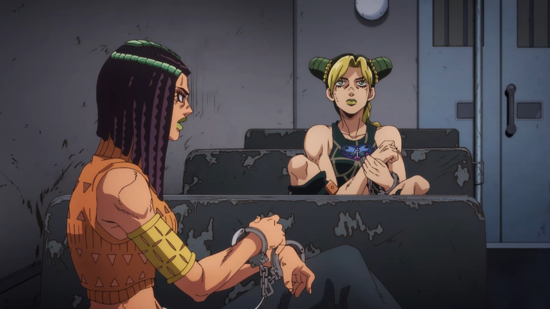
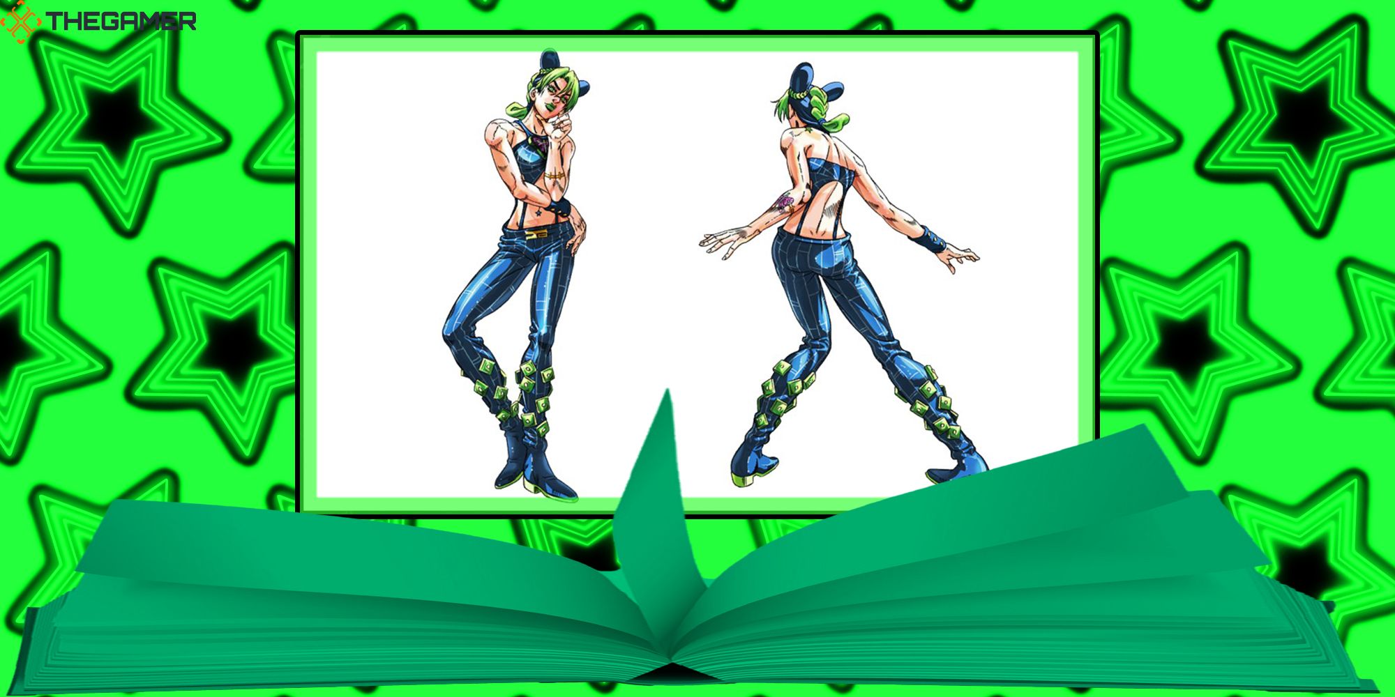
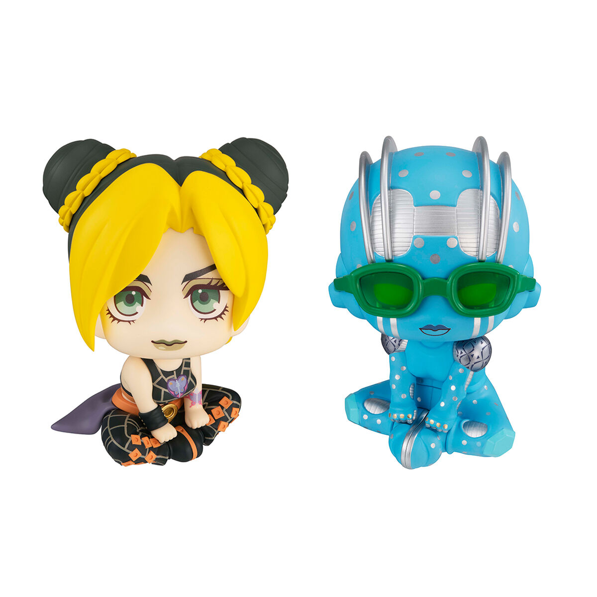
Character Designs: The Case of the Missing Muscle Definition
JoJo characters are known for their... imposing physiques. In previous seasons, the characters were very muscular. But in *Stone Ocean*, the characters suddenly became so smooth.
While Stone Ocean still features uniquely designed characters, they sometimes lack the distinct, ripped muscles of earlier seasons. It's a subtle change, but it does impact the overall visual impression.
Imagine swapping a chiseled Greek statue with a smooth porcelain doll. Still pretty, but a very different vibe. This is the feeling *Stone Ocean* gives.
Is It REALLY That Bad? A Matter of Perspective
Look, at the end of the day, *Stone Ocean* is still JoJo's Bizarre Adventure! It has all the bizarre plot twists, the over-the-top characters, and the stand battles we love. It's JoJo after all.
Maybe the animation isn't always top-tier, and maybe the colors are a bit intense, but the story and the sheer *JoJo*-ness shine through. It's like eating your favorite food that's slightly overcooked. Still edible, still enjoyable, just not *perfect*.
So, while Stone Ocean might have some visual quirks that make it stand out (or not, depending on your preference), it's still a wild and entertaining ride. Embrace the bizarre, appreciate the effort, and remember: It's about the journey, not just the destination (or the color palette).