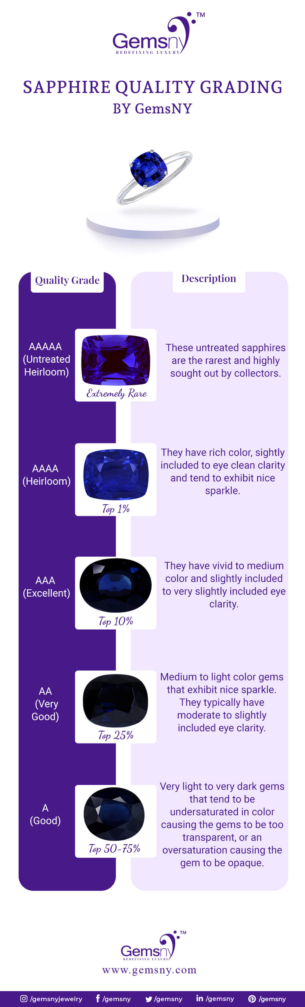
Difference Between Neptune Blue And Sapphire Blue

In the vast spectrum of blues, two shades often spark confusion: Neptune Blue and Sapphire Blue. While both evoke images of deep oceanic beauty, subtle yet distinct differences set them apart. Understanding these nuances is crucial for designers, artists, and anyone with an eye for color accuracy.
At its core, the disparity between Neptune Blue and Sapphire Blue lies in their hue, saturation, and overall undertones. Neptune Blue, named after the distant ice giant, leans towards a cooler, almost ethereal quality. Sapphire Blue, inspired by the precious gemstone, tends to be richer, more vibrant, and sometimes exhibits a hint of purple. This article delves into these differences, examining their origins, characteristics, and applications.
Decoding Neptune Blue
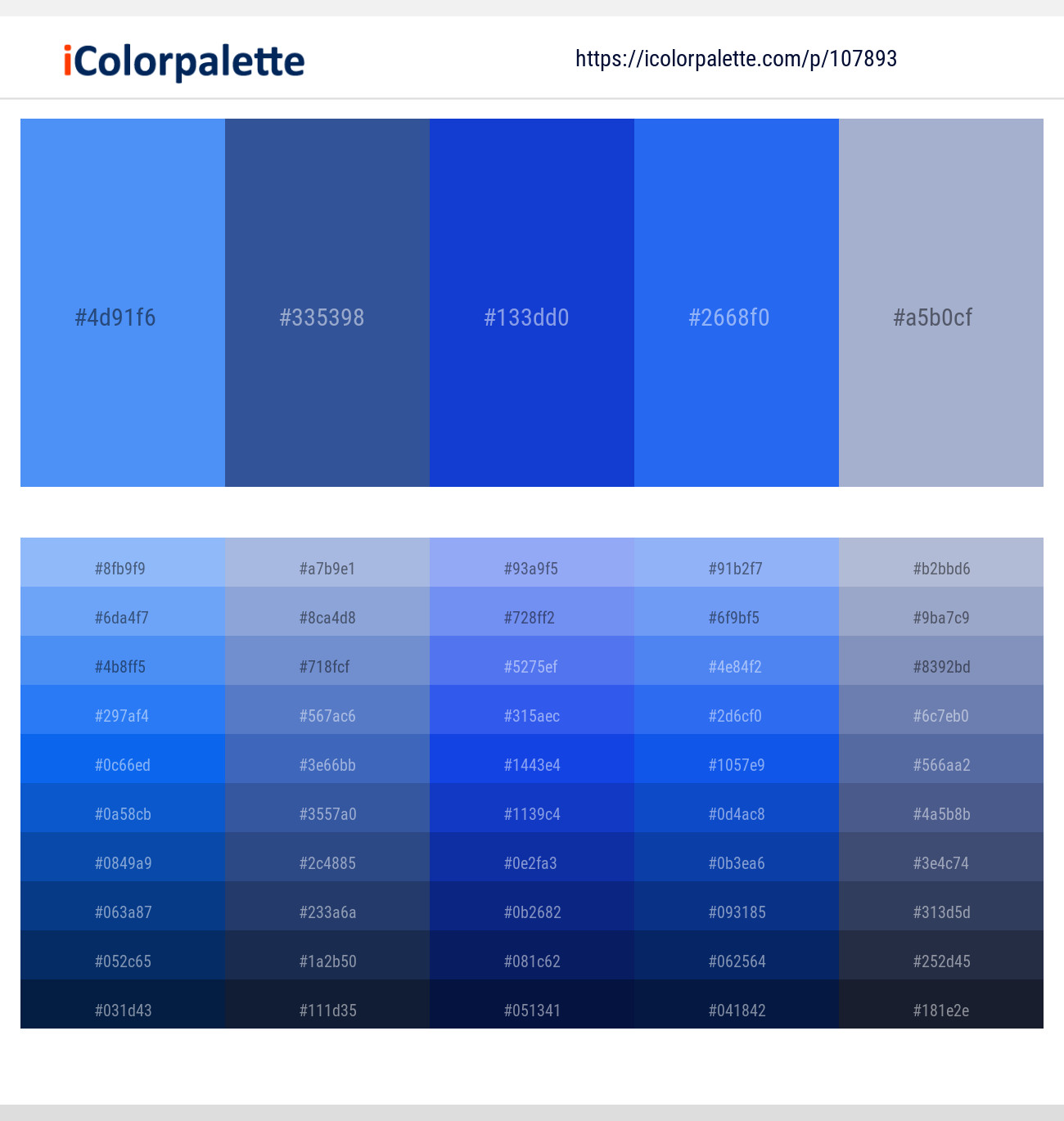
Neptune Blue is characterized by its lightness and a slightly desaturated appearance. This gives it a serene and calming effect. It often has subtle hints of grey or even green, contributing to its cool undertones.
Imagine the planet Neptune shrouded in icy clouds. This captures the essence of this color. According to color experts at Pantone, Neptune Blue is often associated with tranquility, peace, and the mysteries of the deep sea.
Applications of Neptune Blue
Neptune Blue finds extensive use in interior design. It's commonly used to create calming spaces. Think bedrooms and bathrooms, where a tranquil atmosphere is desired.
In fashion, it's often employed for lightweight fabrics. The color creates an airy and ethereal effect. It's a popular choice for summer dresses and delicate scarves.
In the digital realm, Neptune Blue provides a clean and modern aesthetic. It is used in website backgrounds and user interface elements. This creates a sense of trustworthiness and serenity.
Exploring Sapphire Blue
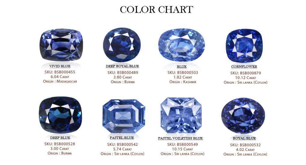
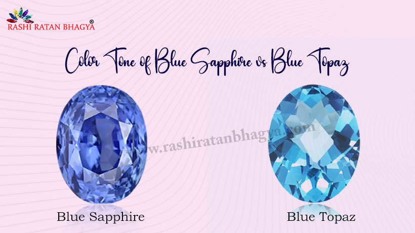
Sapphire Blue, in stark contrast, possesses a much more intense and saturated character. It exudes luxury and sophistication. The color is often associated with royalty and elegance.
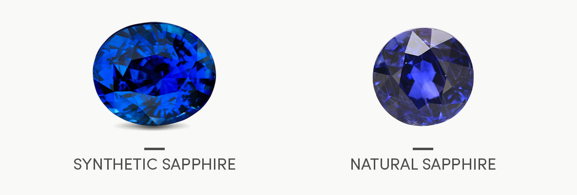
Its richer pigmentation and subtle purple undertones give it a depth that Neptune Blue lacks. This makes it a bolder and more attention-grabbing color. The Gemological Institute of America (GIA) describes the finest sapphires as having a "vivid, evenly distributed blue color".
Applications of Sapphire Blue
Sapphire Blue is a popular choice in high-end fashion. This is due to its association with wealth and glamour. Think evening gowns, formal wear, and statement jewelry.
In interior design, it can be used as an accent color. Sapphire Blue can add a touch of opulence and drama to any space. Think velvet upholstery or decorative accessories.
Within the tech industry, Sapphire Blue is used as a key color. It exudes reliability. Think logos for financial institutions and other businesses looking to project a strong and trustworthy image.
The Science Behind the Shades
The chemical composition of pigments plays a significant role in defining these colors. Different dyes and additives result in varying levels of saturation. The dyes also create different undertones.
The Color Research Institute of Canada notes that the perception of color is also subjective. Lighting conditions and individual interpretation can influence how we see Neptune Blue versus Sapphire Blue.
Furthermore, the medium in which the color is applied—paint, fabric, or digital display—can also impact its final appearance. This is due to factors like texture, reflectivity, and screen calibration.
Comparing Side-by-Side
When placed side-by-side, the contrast between Neptune Blue and Sapphire Blue becomes immediately apparent. Neptune Blue will appear lighter and softer, while Sapphire Blue will stand out with its richness and depth.
The key is to understand the context and desired effect. Neptune Blue offers a subtle and calming presence. In contrast, Sapphire Blue delivers a bold and luxurious statement.
Ultimately, the choice between these two beautiful blues is a matter of personal preference and artistic vision. Consider the overall mood and purpose of your project when making your selection.
Looking Ahead: The Future of Blue
As color technology evolves, we can expect even more nuanced and sophisticated shades of blue to emerge. Digital color matching tools and advanced pigment formulations continue to push the boundaries of what's possible.
The growing interest in personalized color palettes also suggests a future where individuals can tailor their blues. They will tailor them to match their unique preferences and emotional needs.
"Color is a power which directly influences the soul,"said Wassily Kandinsky, highlighting the enduring impact of color on human experience.
Whether you prefer the tranquil depths of Neptune Blue or the dazzling brilliance of Sapphire Blue, the world of color offers endless possibilities for creative exploration and self-expression. Embracing these nuances allows us to appreciate the subtle power and beauty of color in all its forms.