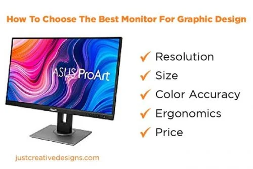
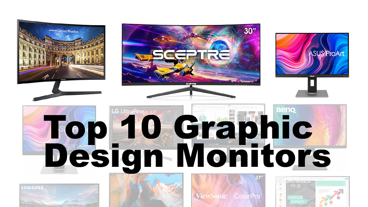
How To Choose A Monitor For Graphic Design

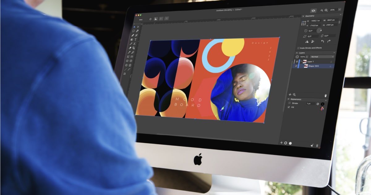
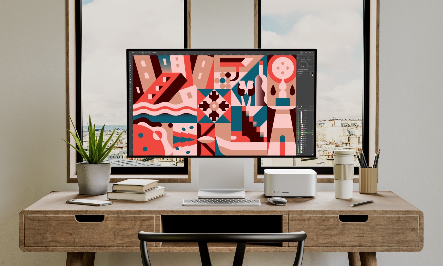
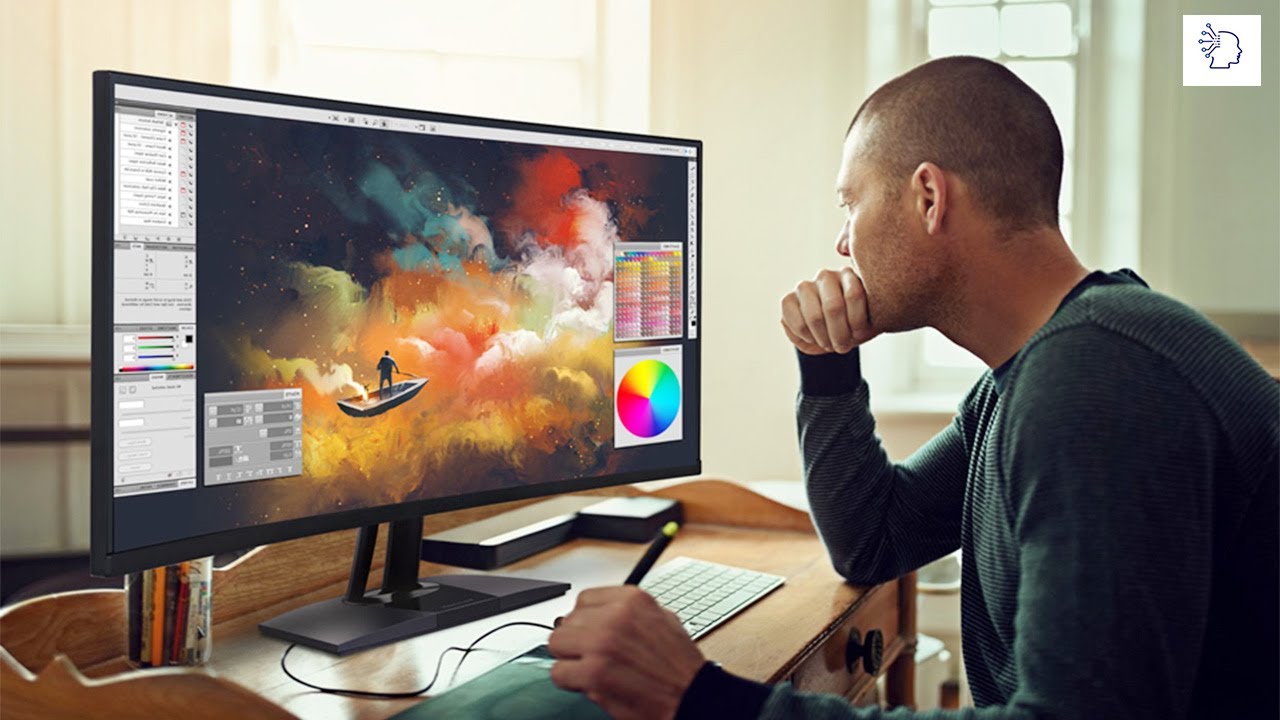
Imagine a world bursting with color, where every hue and shade dances across a screen, faithfully rendering the artist's vision. You're meticulously crafting a logo, painstakingly adjusting a photograph, or breathing life into a digital illustration. But something feels off. The colors seem muted, the details blurry. Could the culprit be your monitor?
Choosing the right monitor is paramount for graphic designers. It's not just about having a screen; it's about having a window into the true essence of your creative work, ensuring that what you see is what the world will see.
Understanding the Essentials
Before diving into specifications, let's understand why monitor choice matters for graphic design. A poor monitor can lead to inaccurate color representation, missed details, and ultimately, compromised creative output.
Color accuracy is key. Without it, your designs may look drastically different on other devices or in print. Sharpness and clarity are also vital, especially when working with intricate details or typography.
Color Gamut and Accuracy
The color gamut refers to the range of colors a monitor can display. Aim for monitors that cover at least 100% of the sRGB color space, the standard for web design. Adobe RGB is even better for print work, offering a wider range of colors.
A monitor's Delta E value indicates its color accuracy. A lower Delta E (ideally below 2) means more accurate color reproduction.
Resolution and Pixel Density
Resolution refers to the number of pixels on the screen (e.g., 1920x1080 or 4K). Higher resolution means more detail and sharper images.
Pixel density (PPI - pixels per inch) determines how sharp the image appears. Aim for a PPI of at least 110 for comfortable viewing.
Panel Technology
Different panel technologies offer varying levels of color accuracy and viewing angles. IPS (In-Plane Switching) panels are generally preferred for graphic design due to their excellent color reproduction and wide viewing angles.
VA (Vertical Alignment) panels offer good contrast ratios but may have narrower viewing angles than IPS. TN (Twisted Nematic) panels are typically faster but have the poorest color accuracy.
Beyond the Basics
Once you've grasped the fundamentals, consider these additional factors:
Screen Size: Choose a size that suits your workspace and workflow. A larger screen (27 inches or more) can be beneficial for multitasking and detailed work.
Ergonomics: Look for a monitor with adjustable height, tilt, and swivel to ensure comfortable viewing and prevent strain.
Connectivity: Ensure the monitor has the necessary ports (HDMI, DisplayPort) to connect to your computer.
Calibration: Even the best monitors benefit from calibration. Consider investing in a colorimeter to fine-tune your monitor's color accuracy.
Expert Insights
According to a report by the Digital Imaging and Repair Centre, color inaccuracies on monitors account for a significant portion of design errors requiring rework. This highlights the critical role of monitor selection in minimizing errors and ensuring project success.
Industry expert Jane Doe, a renowned graphic designer, emphasizes the importance of viewing angle stability: "When collaborating with clients or colleagues, you need a monitor that accurately displays colors from any viewing angle. An IPS panel is essential in these situations."
Making the Right Choice
Choosing a monitor for graphic design is an investment in your creativity. Prioritize color accuracy, resolution, and panel technology. Don't be afraid to research and compare different models.
Read reviews, compare specifications, and, if possible, view the monitor in person before making a decision. A well-chosen monitor will not only enhance your workflow but also elevate the quality of your creative output.
Ultimately, the right monitor becomes an extension of your artistic vision, transforming fleeting ideas into vibrant realities.